GINA Logo
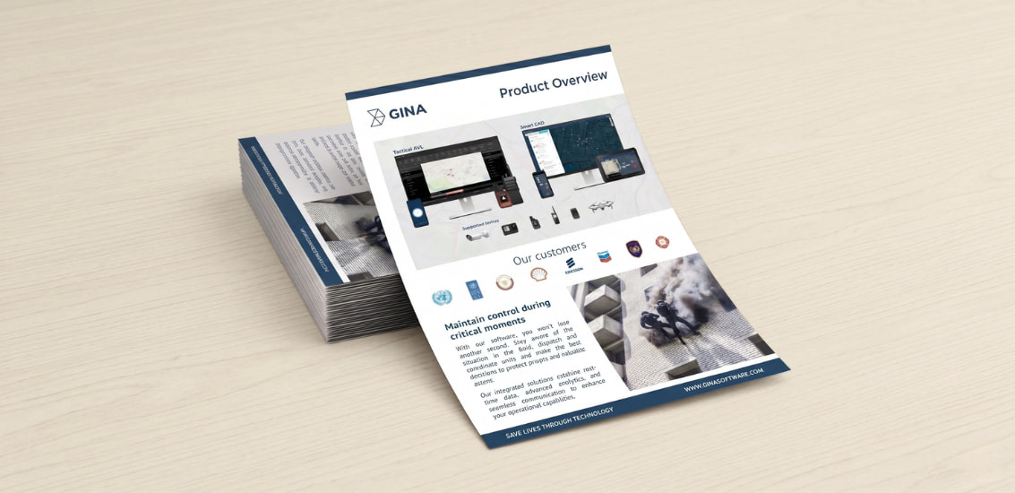
Our logo is the face of GINA. It carries our name into every place our software works, from a dispatcher's console to a responder's phone in the field. Wherever it appears, it should be clear, consistent, and unmistakably ours.

Colors, clear space, and best practices for the GINA Software logo.
Our logo is the face of GINA. It carries our name into every place our software works, from a dispatcher's console to a responder's phone in the field. Wherever it appears, it should be clear, consistent, and unmistakably ours.
The logo should appear only in GINA Blue or GINA White. Never substitute another color for the brand logo.

We never crowd our logo, it needs room to breathe and stand out. The minimum clear space around the GINA symbol is equal to the height of the "A" in the logo. Keep this space free of other logos, type, graphics, and the edge of the format on all materials.


Scale the clear space with the logo: as the mark grows, the protected area grows with it. In dense layouts, dashboards, slide footers, vehicle liveries, give the mark more room than the minimum rather than less.


The logo must read instantly. Choose the Symbol color that holds the strongest contrast against its background, and never place the brand mark where it is hard to distinguish. As a baseline, keep a contrast ratio of at least 4.5:1 between the mark and its background.










Some partnerships may be approved for a GINA-partner logo lock-up. If approved, ensure that there is complete parity of size, placement, and prominence with the partner mark, and that the spacing between the logos follows the GINA clearspace guidelines below.


Using our logos consistently ensures brand recognition and frees us to be creative elsewhere. Avoid these usages: